The classic and easily recognizable label of San Francisco's own Anchor Steam Beer, which has been mostly unchanged since 1965, is being jettisoned by Anchor Brewing in favor a rebranding that helps highlight the brewery's other three main beers. But as with any change like this, especially to a well established brand, it's not necessarily going over well on its initial introduction.
Anchor unveiled the rebranding and new design on Monday, which coincides with the brewery's 125th anniversary, and reactions on Twitter have been swift. In the case of the Steam Beer label which is yellow with blue lettering and graphics, comparisons are being made to Twisted Tea and IKEA, which have similar color palettes.
Some examples of comments:
"Thanks, I hate it."
"Was very kind of you to support graduate designers by giving them some work for their portfolios, but sometimes it's worth paying for rebrands."
"The new label is fine. The old one was iconic. I'm mostly concerned about Anchor Brewing trying to be everything to everybody."
"Just...no. Looks like they are going for Corona's market."
— Courtney Colburn (@courtneycolburn) January 26, 2021
The company is trying something new in order to modernize the branding and have the labels for the four main beers — Steam Beer, Liberty Ale, California Lager, and Porter — cohere in a visual way. There was also apparently an intention to make it "retro chic," but it's not clear if that is playing well, at least with the Twitter set.
Dane Volek, the head of Anchor’s pilot brewing program, tells the Chronicle, "We know it’s going to be a shocking change to some people," but he said the company wanted to make sure that the broader public understands they make more beers besides Anchor Steam. "We still get some mail addressed to ‘Anchor Steam Brewery,’" he says.

On the new landing page for the rebranding, the company says, "We’re honoring our past while staying true to our roots, with a look as bold as the brand it represents. But with beer as it is with people, it’s what’s inside that counts. And we didn’t change a thing about our iconic beers."
Below, a side-by-side comparison of the original, vintage-style label, and this new "retro-chic" version.

The Chronicle then went and followed up with the 93-year-old illustrator of the old label, Jim Stitt, who's responsible for all the earlier label designs that are now being replaced. Stitt worked for Anchor for 45 years before retiring in 2019, and he was as diplomatic as one might expect.
"I expected them to make some major modifications, and they did. I think it’s OK. It’s not bad, it’s just different," Stitt says. He praised the eye-catching nature of the new label, which he says appears to have "strong shelf impact" in stores. He added, "I think what they’ve done is probably correct for the current audience."
The truth is that in an extremely crowded marketplace for craft beer, eye-catching labels likely do make a big difference these days, especially with younger drinkers who have no particular association with the Anchor Steam brand. And the emphasis that brewmaster Fritz Maytag — who took over the legacy brewery in 1965 and turned it into an early pioneer in the nation's craft beer renaissance — on keeping the labels hand-drawn may no longer have the same resonance. As the Chronicle notes from talking to Stitt, Maytag said, "handmade beers require handmade labels." But these days, lots of smaller craft breweries, whose beers are arguably even more handmade than Anchor's, are doing all kinds of crazy things with labels and beer names, and it becomes tough to stand out.
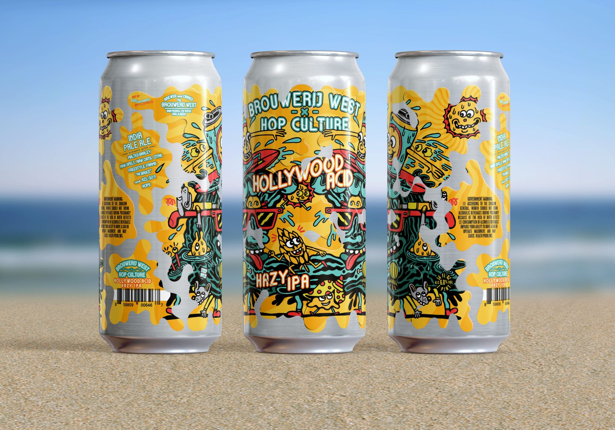
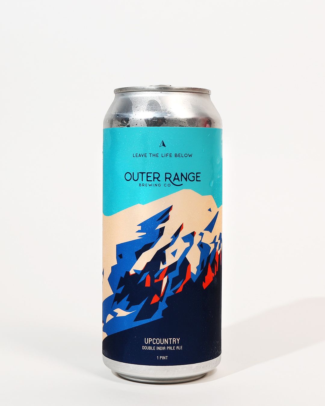
The beer blog Hop Culture highlighted its picks for the 20 best beer labels of last year, and below are just three examples that show the state of the art — which has gotten even more creative as cans have come back in fashion, and craft brewers can commission and print unique, colorful labels for one-off beers at will, simply sticking them on the outside of plain aluminum cans.


Anyway, good luck to Anchor Brewing in weathering the opinion storm!

