A guy who likes crunching publicly available data has turned his sights on a "hot or not" style ratings map for restaurants in San Francisco, LA, and New York, which is powered by AI and yields some highly questionable results.
The interactive site is called LooksMapping, and the design is charmingly basic — even including some rainbow lettering for "Looks" in the style of the old-timey Google landing page.
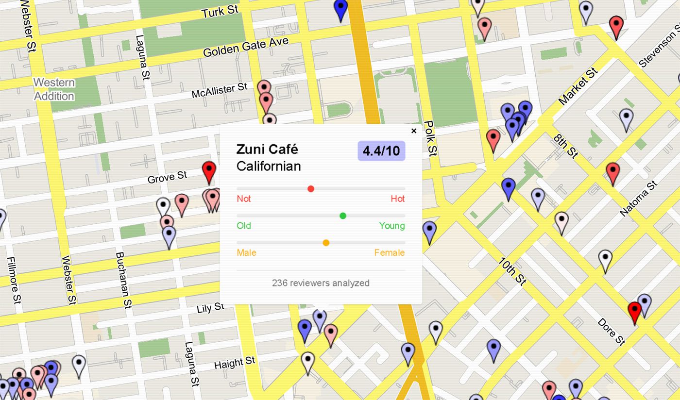
"I scraped millions of Google Maps restaurant reviews, and gave each reviewer's profile picture to an AI model that rates how hot they are out of 10," says San Francisco-based website creater Riley Walz. "This map shows how attractive each restaurant's clientele is. Red means hot, blue means not."
Walz, by the way, was profiled by Wired last year, and has been the mastermind behind a number of other entertaining and nostalgic-looking sites, including Bop Spotter, which picks up on every song it hears from a mystery microphone location in the Mission District, using Shazam 24/7.
Walz admits, regarding LooksMapping, "The model is certainly biased. It's certainly flawed," and how could it not be? But he's created a methodology document that explains how the AI model ranks users, giving them "unattrativeness" and "attractiveness" scores — though I'm still not clear on what the model is doing here. And this is all highly dependent on how many Google reviews a restaurant has, and how many of those reviewers had photos of themselves attached to those reviews.
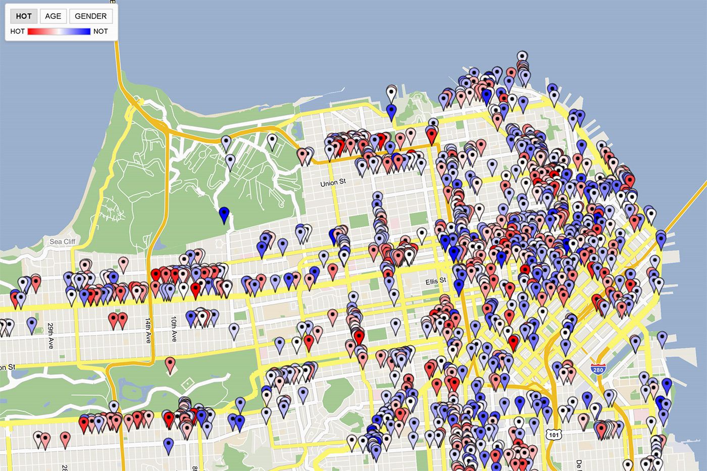
And the results are fairly strange! The top-rated restaurants based on customers' attractiveness are some random hot-pot spots — Fondue Chinoise and Hot Pot Champ, both in Chinatown/North Beach — as well as Ararat Kebab & Gyros on O'Farell Street in the Tenderloin, the Google reviews of which can be seen here.
Zuni Cafe's clientele? Not hot, says the bot, with a an overall 4.4 rating on a 1-10 scale. Brunch spot Son & Garden at the Hotel EPIK on Polk? Oh the crowd is hot there, with an 8.8 overall rating. Bansang in the Fillmore gets a big 9.1 hotness rating, while across the street, State Bird Provisions and The Progress have ratings in the sixes.
Do with this what you will. But I'll note that the creator, Walz, has also created a cool site that has archived images of newspaper front pages, from a swath of national newspapers including the SF Chronicle and New York Times, and you can toggle back through the years to see what was happening on this day in recent history — or compare what various cities' papers were most concerned with that day.
Related: Chronicle Launches Not-Particularly-Helpful AI 'Chowbot' For Food Recs