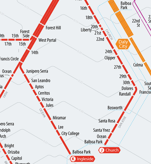
Today in maps: Peter Dunn of Stone Brown Design has created this time-scaled map of Muni, BART and Caltrain, all arranged by how long it would take you to get to commute to of the downtown San Francisco stations. The result looks like a bit like a contour map, but with the elevation lines replaced by travel times. In other words: travel times from stations on the same concentric ring take the same amount of time to get down to Embarcadero station.
Of course, the scale is based off of scheduled arrival times, which are sketchy at best for Muni; Caltrain, likewise, has a hard time getting trains out of the station on time and BART is only slightly closer to their goal of 95% on-time performance. Still, with a quick glance at Dunn's map, you can easily tell the real-world time it'll take to get from San Leandro to downtown. Stations with multiple modes of transit will show up several times on the map because travel times vary with each mode. Balboa Park, for example, always seems way farther from downtown on Muni than it does on BART:
Naturally, the whole thing is available as a large print suitable for hanging in your apartment which is no doubt convenient to a local transit hub, in exchange for a donation on Kickstarter. You can also read more about Dunn's methodology on his site here.
Time-Scale Map of San Francisco on Kickstarter
[Stone Brown Design]
[H/t: Atlantic Cities]